Introduction
In this project, I will showcase my expertise in creating an intuitive and visually appealing Sales KPI Dashboard using Power BI. Through this write-up, I will provide a step-by-step breakdown of the process I followed to develop the dashboard, highlighting the importance of such a tool for businesses.
Objective
Before diving into the design process, it is crucial to establish the objectives of the Sales KPI Dashboard. This involves understanding the specific needs and goals of the business, such as monitoring sales performance, identifying trends, and enabling data-driven decision-making.
About the Dataset
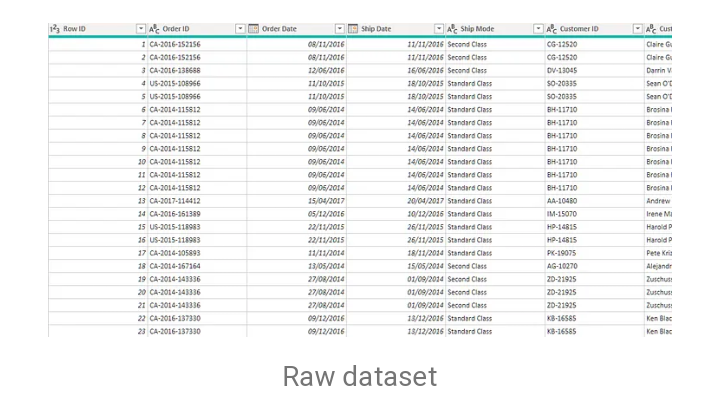
The data was obtained as an excel file from a secondary source, thanks to @baliqis who give me an authorized to use the dataset for this project. The data consists of the following columns: row, order id, order date, ship date, ship mode, customer id, customer name, segment, country, city, state, postal code, region, product id, category, sub-category, product name, sales, city, quantity, discount, and profit.
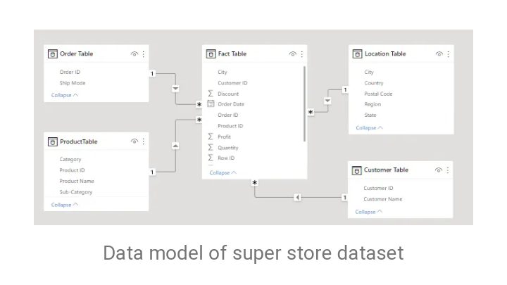
 After importing the dataset into the power query, the values were categorized into the dimension table and fact table.
- The fact table is a table that contains quantitative data, number data types, dates, continuous variables, foreign keys, and duplicates
- The dimension table consists of qualitative data, text data type, categorical variables, primary keys, and no duplicates.
All dimension tables (foreign keys) were connected to the fact table (primary key), establishing relationships between all of the tables. This is done in order to link all pertinent data and create zero-error visualizations.
Data Cleaning Process
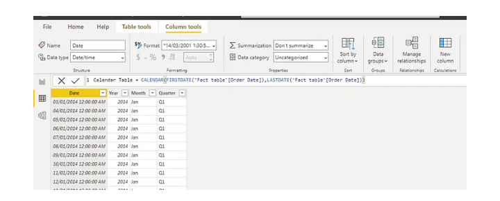
- I created a new measure called Calendar Date and extracted the date (date and time) from the Order date column using the Dax formula (Calendar function) listed below:
- Created a new column and extracted the year from the calendar date, using the function below;
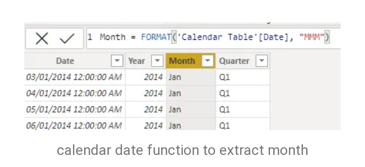
- Created a new column for the month, which was also extracted from the calendar date column.
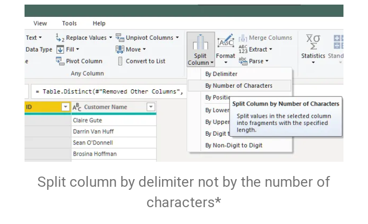
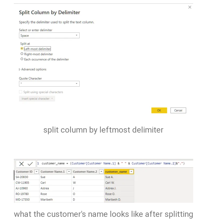
- I shortened the customer's name because it appeared too long by using only the first name and the first letter of the last name. I split the customers’ name column by delimiter and extracted the first letter of the last name, i.e; ‘Biliqees Abolomope’ was transformed into ‘Biliqees A’.

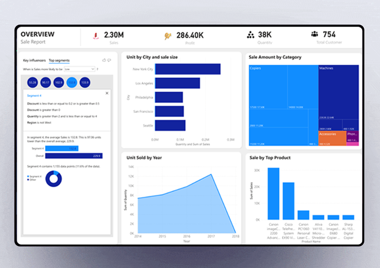
Designing the dashboard
- With Power BI, I carefully selected the appropriate charts, graphs, and tables to represent the sales KPIs, ensuring that they provide clear insights at a glance.
Implementing Drill-Down and Filter Functionality:
- To enhance the dashboard's interactivity and usability, I incorporated drill-down and filter functionalities. This allows users to dive deeper into the data, exploring sales performance at different levels of granularity, such as by region, product category, or time period.
Incorporating Trends and Forecasting
- To enable businesses to make proactive decisions, I included trend analysis and forecasting capabilities in the Sales KPI Dashboard. By visualizing historical sales data and using appropriate algorithms, the dashboard can provide insights into sales trends, seasonality, and potential future performance.