I’ve always been curious about how analytics can do more than report numbers — how it can shape critical decisions, save resources, and even lives.
That curiosity led me to this project:
A Healthcare Emergency Decision Support Dashboard built with Power BI.
Not just as a portfolio piece.
But as a personal quest to show what’s possible when data meets urgency in healthcare.
The Objective
The goal was simple on paper, but powerful in impact:
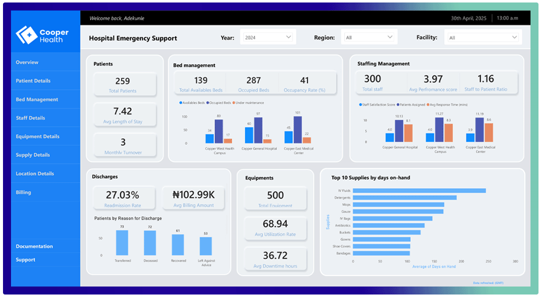
To create a single, easy-to-use dashboard that helps healthcare decision-makers manage emergency situations better.
Specifically, it had to provide real-time, actionable insights on:
- Active patient details
- Bed availability and management
- Staff on duty and shift details
- Equipment usage status
- Supplies and inventory levels
All at a glance.
Because in emergency care, time isn’t a luxury.
Step 1: Framing the Problem Clearly
I started by asking:
If I were managing a busy emergency ward right now, what would I need to know to act quickly?
From there, I drafted a list of must-have decision points:
How many patients are currently admitted?
How many beds are free and where?
Which staff are on duty or off shift?
What equipment is available and where is it being used?
Are critical supplies about to run low?
That became my core dashboard scope.
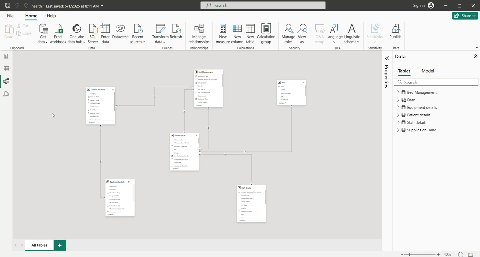
Step 2: Designing the Data Model
I mapped out the data sources I’d need to feed this dashboard.
Since this was a personal build, I designed synthetic datasets simulating:
- Patient admission & discharge records
- Bed allocation records
- Staff rosters
- Equipment inventory logs
- Supplies stock records
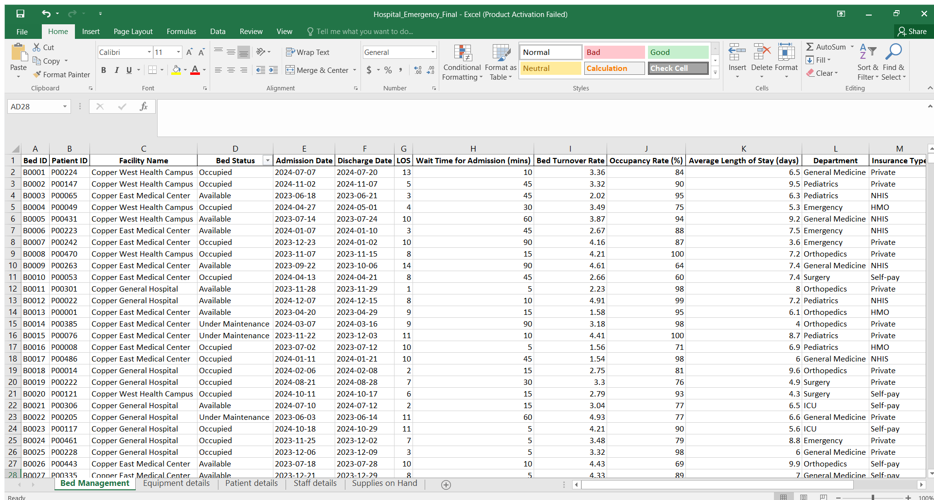
Then, I built a relational data model in Power BI to connect them.
This step was crucial — a well-structured data model is what makes fast, reliable reporting possible.
Step 3: Crafting the Visual Story
I moved to dashboard design, guided by a principle:
Don’t make them think. Show them what matters.
Here’s how I laid it out:
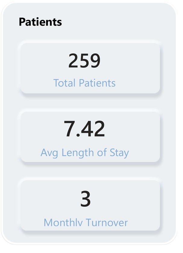
Cards for quick stats: total patients, average length of stay, and monthly turnover
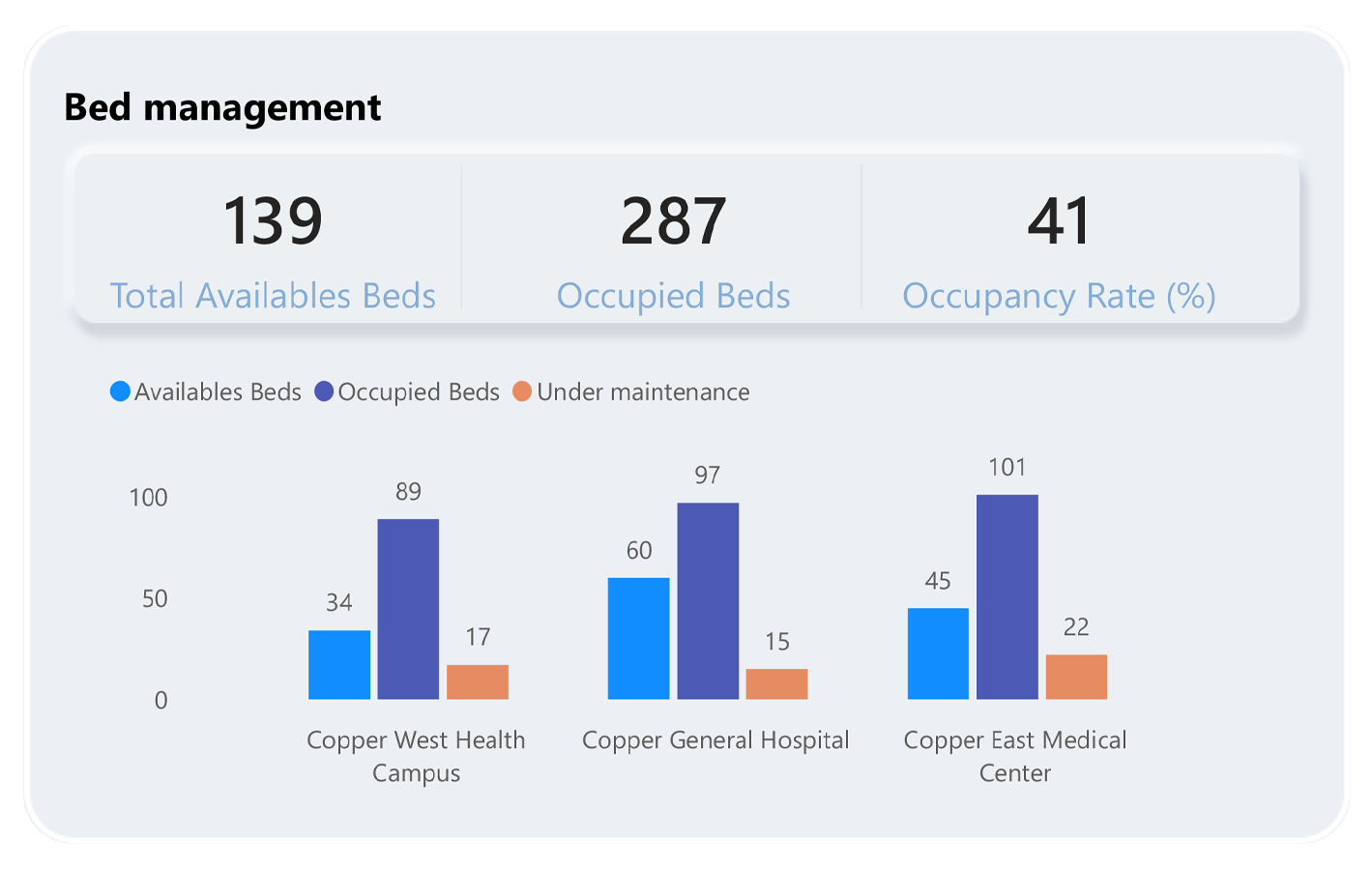
Bar chart that shows bed occupancy by ward : total available beds, occupied bed, and occupancy rate
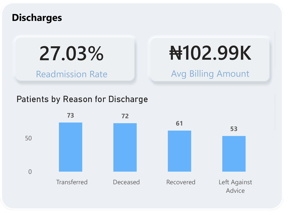
Bar chart with card that shows patient discharges : total patient transfer, deceased, recovered, and totla left against advice
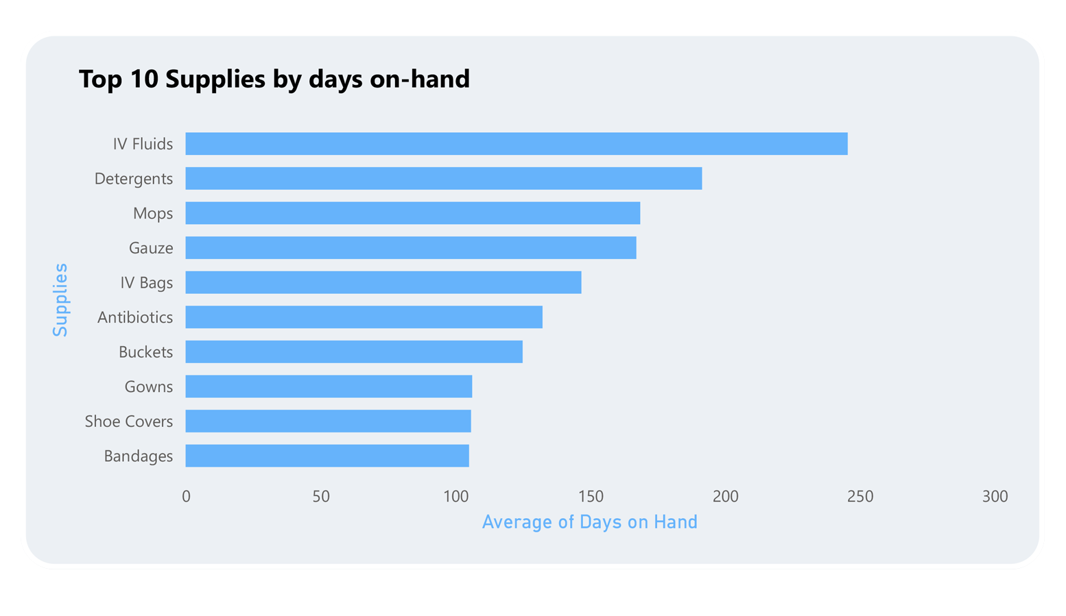
Clustered bar chart that shows supplies day on hand
Step 4: Ensuring Real-Time Relevance
I configured data refresh triggers so that the dashboard could simulate real-time updates, reflecting the latest patient counts, bed statuses, and inventory changes.
In healthcare decision-making, even a 30-minute-old report can be too late.
Step 5: Prioritizing Usability
After the first build, I reviewed it like an emergency room manager would:
Was it clear at a glance?
Were the most important numbers unmissable?
Could someone unfamiliar with analytics understand it?
I stripped away clutter, simplified charts, adjusted color contrast for visibility, and ensured responsive navigation.
Key Lessons Learned
The best dashboards aren’t the prettiest — they’re the clearest.
Always design with your end-user’s moment of need in mind, not your own analyst preferences.
Every dashboard tells a story. If yours doesn’t, keep refining.
Final Thoughts
This project reaffirmed something for me:
Analytics in healthcare isn’t a luxury. It’s a lifeline.
And as data professionals, we have a responsibility to make our insights not just accurate — but timely, usable, and life-saving.
This dashboard is a step in that direction. And I’m proud of what it represents.